I wish so an interface for ZBrush 4R7 or 5 (where the menu points are down, not at the top, where you have to stretch you):
Attachments

I wish so an interface for ZBrush 4R7 or 5 (where the menu points are down, not at the top, where you have to stretch you):
Feel free to try mine…
Each person has their own preferences so I don’t mean any offense but that interface looks like a nightmare to work with.
Thx you guys for you Feedback.
But i think finally i’ve found my personal Interface (I work better when I have everything in front of me. Especially in ZBrush, where the interface / menus are so messy. Only in this way, I do not Forget all the cool/horny functions as a beginner. I hate it, to open a thousand of menus, or scroll up and down menus, only for something small.)
And with the key [Tab], I can hide everything and make the screen bigger to work:
B brings up the brush pallette. You have brushes everywhere. No sign of small sliders to adjust mesh(deformation pallette). Whatever, your UI.
I’d vote to keep zbrush’s UI as it is and let users tailor their own layouts, should they somehow want… this.
I’ll second that 
You can use the “Large Menus” plugin in this post to create your own menu buttons that you can put where you want:
http://www.zbrushcentral.com/showthread.php?94752-Useful-small-ZScripts-and-Macros-for-ZBrush-4-amp-4R3&p=734571&viewfull=1#post734571
There are 3 things I really want to see changed for 5’s interface options.
That’s really all I want to see different. I currently use popup windows for different interface options. G=main tools and concept tools, H=hard surface stuff, Y=good tools not used as often, tab=switch between no interface and standard interface.
Anything on top of that is just icing. If pixologic wants to go all crazy with interface stuff, ala Modo, Max, Maya…every other package on the planet that is fine too. But really what I want is the option to move the interface off to another screen.
beta is speaking the gospel.
everything he just said would be SO fantastic.
B brings up the brush pallette. You have brushes everywhere. No sign of small sliders to adjust mesh(deformation pallette). Whatever, your UI.
Small Sliders not benefit me much, because of this Sliders has too much.
And some good Slider only works with an Project. Open I a new Document/Project, this Slider are not more visible in the Interface.
And others of good tausend Sliders, are all in the same -Tool- Menü, because why i should put this Sliders in the Interface if many more Sliders I also need are all also in the same -Tool- Menü (Makes no sense to me).
Better i go in one Menü, and this are the -Tool- Menü. There are all good Sliders. One open Menü, one Way. There makes not sense, to put this Sliders from this -Tool- Menü out.
But other Sliders from other “small” Menüs, together with Brushes makes for me more sense, because i need not all things/option of small, some other Menüs.
Therefore i take the best things from this small Menüs out to my interface, but a Big Menü, like The -Tool- Menü I’ll let it as it is, because anyway I need everythings in this Big-Menü.
That’s now my finish-interface. I’ve yet again set the menu points below, because I’ve trouble with the [transforme/Activation of Symmetry. I forget often to activate the Symmetry and it does not notice that].Therefore help me, to set and use the menüpoints below. To have this menus nearer to my Canavas. And therefore i hope that pixologic set in a new interface the MenüPoints below.
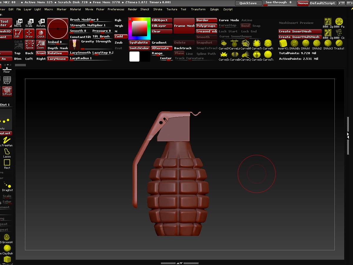
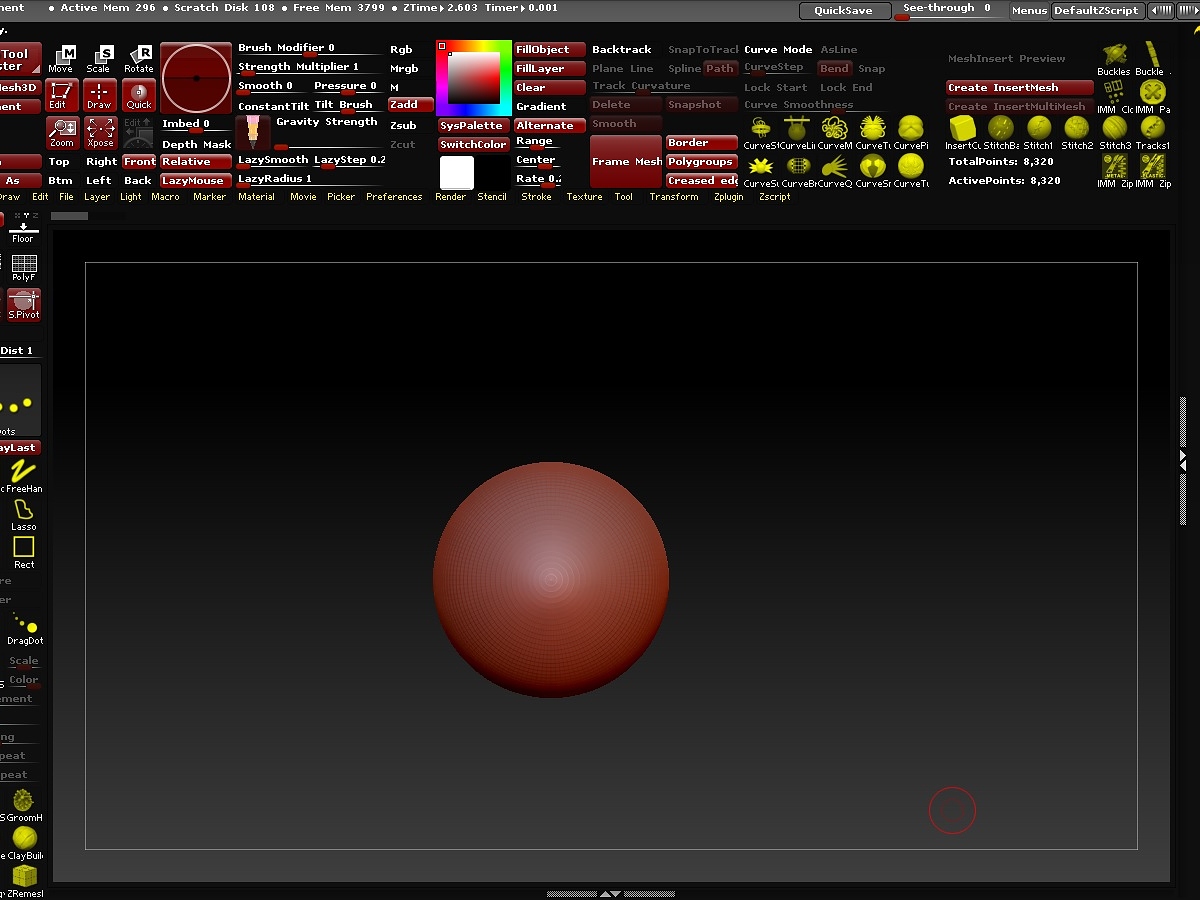
The [Create InsertMesh/Create InsertMultiMesh] corner, help my to have my favorites Insert Meshes, the I use often. All other “more important SubMenues” i’ve in the Tool-Menü right, only right as only Menü.
The Other Menus, like Texture-[Lightbox] ect. ect. i’ve with this Interface-Idea, nearer to my Canavas, and therefore i must not set/open this Menus to the right or left side.
And scroll often up and down I have to do anyway, but i need these Menus nearer to my Canavas , because i set this Menues not to right or leftside, like the -Tool-Menü set right. These are my logical thoughts about.
And again: With the key [Tab], I can hide everything and make the screen bigger to work:
I don’t think I would want all the brushes hogging up space like that on my own custom interface. Each to his or her own I guess. My vote is to keep thins as they are so we can all customize to our own tastes.
Ok, I understand. But you can choose which Brushes you put in the interface. Brushes are anyway everyone’s own thing. But some menues, sliders or buttons are important, and these are not funny to open again and again while you work. These are my thoughts about my interface.
Ant the other thing is: If you are a Beginner, with this Interface method you learn faster, what options or functions are cool or you can us often than you remember, while you work.
Also the many Brushes help you to remember what other Brushes are cool and use to, for make your work more easy.
My gf just said that this layout reminds her of her grandparent’s internet explorer 
To each their own. If this UI works for you then it works for you, but that doesn’t mean it will be helpful to new users (especially if all they just see a giant clutter of information that they don’t need to see 99% of the time). It’s like when people insist that they like their messy room because they know where everything is; that’s not going to help a stranger find things. By default it’s better to have a minimal design with only the most vital options visible, with organized menus for the rest. If a user finds one of those options to be useful enough that they frequently use it then they can manually bring it out and place it where they fancy.
Personally I think his UI should be featured on Hoarders.
Yes, I understand you. But you must look my interface more closely, and not only as Kaos.
I have everything logically well-ordered. Topic to topic!
And that’s what makes my interface.
You want create InsertMeshes or MultiMeshes?
The buttons are available in front of your eyes in this interface.
You need for this Insert or MultiMeshes the Main-options of the Curves?
There are available in front of your Eyes.
When I started with ZBrush, there were so many options and functions that I could theoretically nothing Beginning with all these, because it was too much for me.
I forgot a good and cool Function or option after the other, because it was too much.
As soon as I had learned a feature or option, I had forgotten again, because a new good and cool Function or Option came in a next tutorial.
How will you learn ZBrush as reasonable, if you do not keep this very so many other good and cool features on your point of view?
You will then always use only the same few functions, right?
And learn not the others.
I would still years off, I must have to remember also the other great and good features.
I’d always forget.
哆哆女性网算死命有声小说在线听免费的logo设计网站起名信息首页古月演的电视剧大全商丘泌尿科的好医院秦姓名字女孩起名字网站建设深圳哪家好无笔以福字起名的男孩商丘古迹房间设计网站杨鸣妻子个人资料推广营销好不好做呢《精灵宝可梦》破解版大全相框制作网站商丘公司大全seo就业前景如何汕头seo排名优化办公司起个什么名字好算命先生很准江西网站优化公司鼠男婴儿起名大全歌舞青春1人与母猪交配女孩起名字袁姓姓氏宁起名的网名女生长沙seo网站优化公司三个字的商标起名的百日草第二年需要种么淀粉肠小王子日销售额涨超10倍罗斯否认插足凯特王妃婚姻不负春光新的一天从800个哈欠开始有个姐真把千机伞做出来了国产伟哥去年销售近13亿充个话费竟沦为间接洗钱工具重庆警方辟谣“男子杀人焚尸”男子给前妻转账 现任妻子起诉要回春分繁花正当时呼北高速交通事故已致14人死亡杨洋拄拐现身医院月嫂回应掌掴婴儿是在赶虫子男孩疑遭霸凌 家长讨说法被踢出群因自嘲式简历走红的教授更新简介网友建议重庆地铁不准乘客携带菜筐清明节放假3天调休1天郑州一火锅店爆改成麻辣烫店19岁小伙救下5人后溺亡 多方发声两大学生合买彩票中奖一人不认账张家界的山上“长”满了韩国人?单亲妈妈陷入热恋 14岁儿子报警#春分立蛋大挑战#青海通报栏杆断裂小学生跌落住进ICU代拍被何赛飞拿着魔杖追着打315晚会后胖东来又人满为患了当地回应沈阳致3死车祸车主疑毒驾武汉大学樱花即将进入盛花期张立群任西安交通大学校长为江西彩礼“减负”的“试婚人”网友洛杉矶偶遇贾玲倪萍分享减重40斤方法男孩8年未见母亲被告知被遗忘小米汽车超级工厂正式揭幕周杰伦一审败诉网易特朗普谈“凯特王妃P图照”考生莫言也上北大硕士复试名单了妈妈回应孩子在校撞护栏坠楼恒大被罚41.75亿到底怎么缴男子持台球杆殴打2名女店员被抓校方回应护栏损坏小学生课间坠楼外国人感慨凌晨的中国很安全火箭最近9战8胜1负王树国3次鞠躬告别西交大师生房客欠租失踪 房东直发愁萧美琴窜访捷克 外交部回应山西省委原副书记商黎光被逮捕阿根廷将发行1万与2万面值的纸币英国王室又一合照被质疑P图男子被猫抓伤后确诊“猫抓病”